A Classical Meets Modern Branding Approach
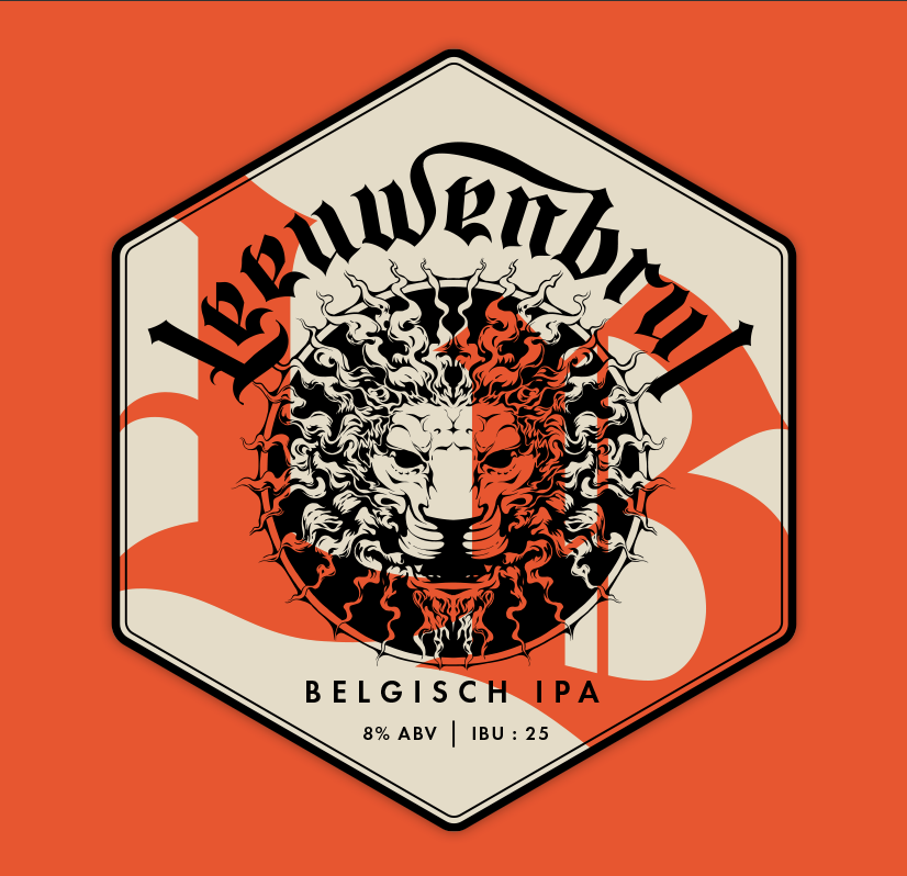
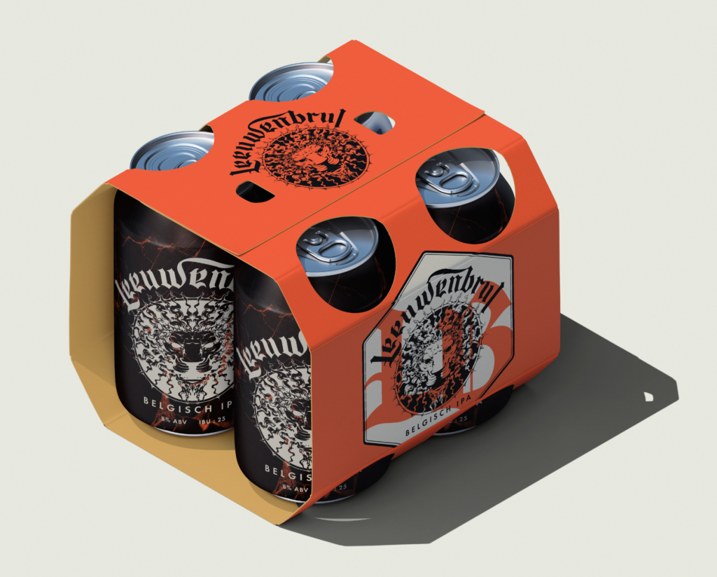
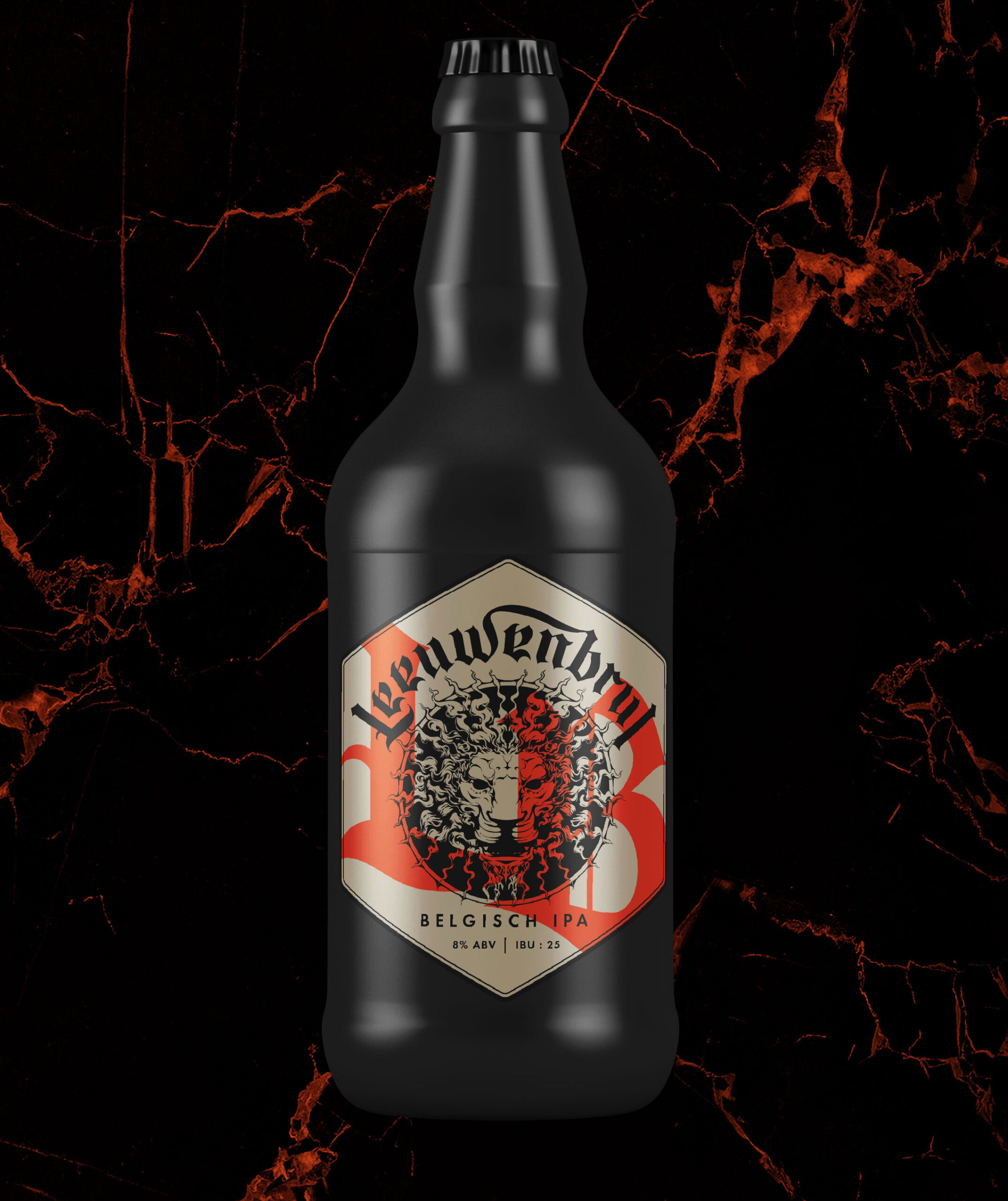
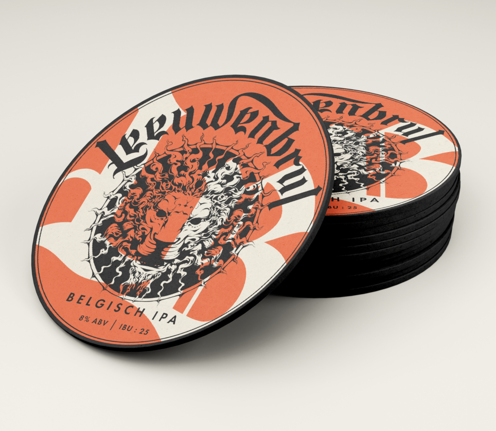
Leeuwenbrul, a Belgian-style IPA that bridges tradition with contemporary craft, demanded a branding approach that honored both. The logo’s bold lion head illustration, inspired by the iconic Flemish regional symbol, stands as a testament to the beer’s roots in Flanders. Complementing this emblem is the logo type, rendered in a striking Belgian blackletter font, adding a classical touch that evokes the rich history of the region. This fusion of classical motifs with modern design aesthetics encapsulates the essence of Leeuwenbrul—a beer that respects tradition while embracing the craft beer future, ensuring it captures attention on any shelf.


